Pinterest is where I went for inspiration for my whole house. Browsing the internet gave me too many options and bookmarking the images I liked was more difficult than Pinterest.
So, I am going to show you the pictures on Pinterest, with the pictures from my house below it so you can see my inspiration.
Inspiration for my bedroom:
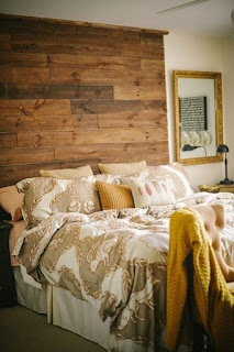 |
| I loved this Pinterest headboard. |
 |
I loved this headboard on Pinterest too.
|
 |
| I loved the bed facing windows/doors on Pinterest |
 |
I loved this Fixer Upper design by Joanna Gaines for
bedding inspiration. If you'll notice, I reversed the
colors because I don't think I'm adult enough to have
a white bedspread. |
 |
| Pinterest bedroom ceiling inspiration |
 |
| Wall color and ceiling from Pinterest |
 |
| Wall and floor colors from Pinterest |
And here is what you get when you put all of that together!
 |
| My bedroom |
 |
Kara's room before furniture.
Looks a lot like the picture, right? |
This was my inspiration for my kitchen. You'll notice the sink in the island with the cooktop behind it. You'll notice the vent hood above the stove is just like mine. So are the cabinets and crown molding. Also, the corner posts on the island and square corners on the counters are the same as me. Not to mention chairs at the island AND even the lights are just like the ones I picked!
 |
| I want everything from this kitchen for mine - from Pinterest |
When you raise the hood to leave the counters on each side of the cooktop free, do a two tiered island to hide the mess in the sink, and change the counters to marble, this is what you get!
 |
| My kitchen |
 |
| My kitchen |
The pantry and the tornado shelter were going to be two separate rooms at the very beginning of this, but then they told me it can be just one big room and I was thrilled! I got on pinterest and took this away from my favorite posts: lots of different height shelving, shallow so stuff doesn't get blocked in the back, make room for small appliances (and even add electric outlets), some hidden storage with drawers, put a rug or something in there to make it feel like a room.
 |
| Pinterest pantry |
 |
| Pinterest pantry |
From this kitchen below, which I love, I got my colors, and I noticed how I could see into their pantry from this view. I loved how there is matching cabinetry in there, so I mimicked that - but only where you can see in from outside the kitchen.
 |
| Pinterest kitchen and pantry |
And now, here are pictures of my pantry.
 |
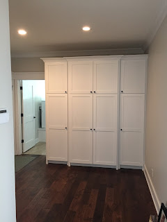
My pantry from out in the kitchen
See, looking in you can see matching
cabinetry. |
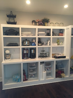 |
Back wall in the pantry - room for appliances
and outlets behind |
 |
My pantry - shallow shelves, make it pretty
like a room. I have pictures in there and
decorations I love. It's a place I enjoy being. |
 |
| My pantry - this is the wall you can see from the kitchen |
I saw this post on Pinterest and I did the showers with this tile. The thirds version with the check mark. Alas, we have some brick pattern subway tile in the house too. *gasp* What would Pinterest think?! lol. Fortunately, I don't care because I love each way.
 |
| Pinterest tip |
 |
Can you tell from this picture that the
tile is done in thirds? It's really
obvious in person. And I love it. |
Speaking of showers, I saw this on Pinterest:
 |
| Pinterest idea - use these for shelving |
 |
My shower - the guys said one on top
of each other would get dirtier faster,
and recommended side by side. |
Ooo. My closet. Michael and I both were getting separate closets, and mine was going to be nice and big. From this picture, I realized I wanted a little chandelier, and I wanted to use every square inch of space possible, using shelving.
 |
| Pinterest closet |
And now here are mine and Michael's closets.
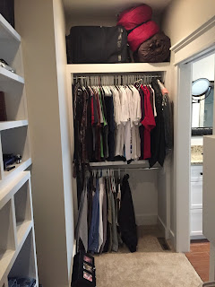 |
Michael's closet - he still has half a rack
to grow into. |
 |
Michael's closet. Guns, books, camping
gear. I mean, what else does a man need? |
 |
My closet. I still have a large bottom rack
to grow into. |
 |
Winter clothes on the left, bags in the middle,
tall dresses and boots on the right. |
 |
| Shoes and necklaces |
 |
| A few more shelves to fill |
The exterior of the house. I had no idea whatsoever what I was going to do outside. I basically pinned the pictures I liked the most of houses and noticed a pattern. They were all craftsman style, they all had stone on the bottom, and they were all gray or brown on top. Oh, and they all had no shutters and bright white trim.
 |
| Pinterest picture |
 |
I loved the way these stairs looked on
this Pinterest picture, so we designed
around this. |
And this is my house. Stone, brown, white trim.
 |
| And do you notice the front steps? Yes. |
 |
| Front steps. Thank you, Dad, for taking this picture! |
My bathroom. I knew Michael and Kara wouldn't really care about their bathrooms, so I went neutral with their bathrooms and really glammed it up in mine. This was my inspiration from Pinterest. I loved the mirror with sconces coming through it. I loved the marble. I loved the drawers and crystal knobs.
 |
| Favorite Pinterest inspiration |
 |
I really loved the trim and marble
counter top in this picture. |
And this is what my bathroom ended up looking like:
 |
| It has all I wanted from the pictures! |
In the laundry room, I knew I wanted front loaders. Not just because they are pretty and popular, but because my back is finicky and reaching into a regular washer and dryer is more and more painful the older I get. After using a few, I realized getting front loaders that sit on the floor isn't going to fix anything. So I saw this on Pinterest and realized I needed them raised nice and high. The pedestals you can buy at the store are only 12 inches high. I needed 20 inches high, so they built me special ones. While we were raising up the washer and dryer, they may as well put some drawers under there!
 |
| Design on Pinterest that inspired me |
 |
This is my laundry room. The drawers are
finished now. |
I know I already posted about the exterior, but windows and doors were separate. I loved the way these craftsman style doors were almost all glass, which wouldn't interfere with the view.
 |
| Pinterest door idea |
 |
| Pinterest door idea |
 |
This is my door. The picture is off center because I was
trying to take a picture of the lights. |
One of Michael's requests was that we have a large mudroom. A very large mudroom. Where many people could come in through the garage at the same time, put their stuff away, and not be stepping all over each other.
 |
This was my Pinterest idea for
trim and molding. Also, I still want
to hang a gallery wall. |
 |
This is my hallway in the main area
of the house. Love those beams. |
 |
This is my hallway in between the guest
room and Kara's room. Just begging for
a gallery wall. |
I have always wanted a screened in porch. Maybe it's all those times I watched Dawson's Creek. All the bugs around here are hard to get used to, and an entire outdoor room that filters them out seemed like a great idea - and the best way to get me outside at all. This was the picture that inspired me. I haven't bought furniture yet, but the pillars, lighting, and fans all came from here.
 |
| Pinterest - gorgeous |
 |
Here is my back porch. You'll notice recessed lighting,
chandelier in the middle, and two white fans. The
pillars are in there too. |
The porch floors came from Pinterest too.
 |
| Pinterest stamped concrete |
 |
Our patio - it's stamped exactly like the picture. The
screened in porch is too. |
Once the house was designed, I needed to decide how to furnish it. I loved this picture from Pinterest. All pieces are neutral, allowing the outdoors, ceiling, and fireplace shine. Plus, I've wanted a room where two couches faced each other ever since I saw Father of the Bride 20 years ago.
 |
| Pinterest living room |
 |
| Father of the Bride living room |
 |
| My living room |
Even the doors came from a Pinterest post!
 |
| Pinterest post about craftsman doors |
 |
| As you can see, I picked "door #1" :-) |
I know this post is gigantic, but I thought it was fun to see how Pinterest is wonderful and had a major role in this house!
Stay tuned for these projects:
 |
I have the hooks already in the guest bedroom. This
Pinterest post shows me I just need an old window
and pictures. |
 |
These mirrors with great frames
will be put in the dining room. |
 |
This is the style I'm going for - lake house
meets cabin in the woods. |
Thanks for reading my blog through the building of the house! Of course I'll be posting as I decorate it. :-)




Comments